
Abstract
Institutional sustainability campaigns often rely on static “playbooks” to disseminate pro-environmental advice. These linear, text-heavy resources are difficult to navigate when users must compare actions across effort, impact, and personal relevance. We investigate how different information visualization structures shape sustainability planning by comparing three interfaces: an AI-enhanced List, Quadrants, and an Interactive Map. The interfaces share a hybrid content pipeline in which sustainability practices are curated by human experts and enriched with LLM-generated metadata for visualization. In a within-subjects study with 115 university-affiliated participants, we found no significant differences in adoption volume or perceived discovery across interfaces. However, interface structure substantially affected workload and decision quality. The Map imposed significantly higher mental demand, frustration, and effort than both structured alternatives, lowered decision confidence, and was rated as less helpful than the institution's original playbook. Quadrants emerged as the most preferred interface in post-study rankings, suggesting that lightweight semantic grouping can support exploration without the cognitive cost of free-form spatial navigation. These findings refine the design of AI-enhanced decision support tools for personal sustainability and other multi-criteria personal informatics domains.
1 Introduction
Universities and organizations often promote environmental sustainability through online playbooks: collections of recommended behaviors such as line drying clothes or commuting by transit. Although these resources contain useful advice, they are usually presented as flat, text-heavy lists. Users must infer trade-offs such as effort, impact, and time commitment on their own, making it difficult to compare options and assemble a personally feasible plan.
To address this problem, we collaborated with university sustainability experts to transform a conventional playbook into AI-supported exploration interfaces. We used an LLM to enrich expert-curated actions with structured metadata, including estimated impact, effort, time, and semantic tags, then rendered the same content in three interface paradigms. While visualization research has established frameworks for decision-making and critiqued visualization tools for choice support [21, 23], less is known about how AI-enriched content should be structured for everyday sustainability planning.
This paper compares an AI-enhanced List, Quadrants organized by impact and effort, and an Interactive Map that spatializes the same dimensions. Through a within-subjects study with 115 university-affiliated participants, we examine how these structures affect planning behavior, workload, confidence, and overall preference. Our results show that the free-form Map does not improve adoption volume or discovery, but it increases mental demand, frustration, and effort, lowers confidence, and is perceived as less helpful than both structured alternatives. Quadrants emerged as the most preferred interface in post-study rankings, offering a practical middle ground between overview and guidance. These findings offer empirical guidance for designing AI-enhanced decision support systems in personal sustainability and related personal informatics settings.
2 Related Work
2.1 Eco-Feedback Technologies
Recent research introduces novel approaches to make environmental impact more visceral and engaging. For instance, footprint calculation tools from Ecological Footprint Calculators [11] and EPA [33], and social platforms that harness distributed sustainability information and permit interactive waste sorting practices [29, 30]. Emerging work has further highlighted the shift toward more emotionally resonant and visual climate communication on video-sharing networks [25], and linking digital social behaviors directly to their physical impact on urban environments [20].
Other research explores design methods to foster ethical relations in energy systems through an embodied understanding of energy consumption [1], and tools that enable electronics designers to recycle e-waste components during the design process [17]. We have also begun to see tools utilize statistical visualizations to provide feedback that fosters energy-saving or pro-environmental behaviors [2, 5, 7]. All of these approaches utilize more experiential and interactive engagement to provide valuable educational information, aligning with our goal of bridging the sustainability knowledge-action gap. However, recent large-scale analyses of public interest indicate that despite these efforts, significant gaps remain between information availability and actual engagement [19]. Existing solutions typically focus on raising awareness without effectively facilitating behavior change, rarely offer personalized action frameworks tailored to individual contexts, and seldom provide mechanisms to visualize personal progress over time or simulate potential outcomes of behavior changes.
2.2 LLM-Augmented Exploration Interfaces
Recent work on Large Language Models (LLMs) has extended the exploration of content through information synthesis and personalized recommendations [6, 24, 26]. For example, to strengthen personal sustainability, LLMs can tailor advice to individual goals and associated constraints. However, most LLM-driven applications rely on linear and text-heavy conversational interfaces that emphasize information delivery rather than exploration. Such interfaces offer limited support for comparison, multi-criteria reasoning, and prioritization, which are critical for translating sustainability intentions into concrete actions. As a result, many eco-feedback systems and personal informatics applications present recommendations as static lists or generic repositories, lacking the contextual depth and structural guidance needed to support actionable decision-making [12, 16]. A substantial body of work shows that visuo-spatial organization helps users reason about complex information by externalizing memory, preserving context, and enabling comparison and abstraction [10, 13, 15, 18]. Spatial layouts allow users to perceive relationships, trade-offs, and patterns that are difficult to identify in sequential representations [14, 22, 32]. Prior visualization research has demonstrated the effectiveness of techniques such as spatial layouts, semantic zoom, filtering, clustering, navigation, and coordinated multiple views for managing complex information spaces [3, 4, 12, 27, 34]. However, they also caution that overly complex or depth-heavy visualizations can introduce usability challenges, which indicates the importance of carefully designed, lightweight structures [8, 9, 28, 31].
In the context of personal sustainability, users often balance multiple criteria, including environmental impact, required effort, and personal relevance. Visual structures that explicitly encode these dimensions can support exploration and comparison, and help users reason about trade-offs as well as identify feasible actions. Building on this literature, our work examines how a linear list, quadrants, and an interactive map shape planning behavior and subjective experience when users interact with sustainability practices curated by human experts and enriched with generative AI. This work contributes to the design of intelligent visual interfaces that help users navigate complex, multi-criteria sustainability decisions.
3 Methodology
3.1 AI-Enhanced Interfaces
We developed a web-based platform to investigate how different information structures influence decision-making in environmental sustainability. Participants compared our tools against the sustainability campaign webpage at the authors’ institution. This existing resource served as a mental anchor: a static, text-heavy page where actions are listed linearly under simple headings (e.g., “At Home” and “On Campus”).
Our experimental system used an AI agent (Gemini 2.5 Pro) to transform this raw content into structured visual and textual forms. The AI enrichment added metadata such as impact score, effort score, time estimation, and semantic tags. This shared metadata powered three distinct interface variants (Figure 1).
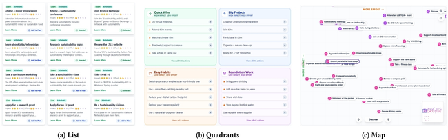
Three interface screenshots used in the study: an AI-enhanced list, a quadrant view organized by impact and effort, and a continuous map view plotting actions by the same dimensions.
3.2 Study Design
The study employed a within-subjects design with 115 university-affiliated participants, the majority of whom were students. The age distribution skewed young, with 98 participants aged 18–24, 15 aged 25–34, and 2 aged 35–44. Most participants were students (104/115), including 50 graduate students, 28 juniors, 16 seniors, 5 sophomores, and 5 freshmen; the remaining participants included 6 alumni, 2 faculty members, and 3 other university-affiliated adults. Self-reported sustainability interest was moderate to high on a 5-point scale (M = 3.74, SD = 0.86). Participants interacted with a pool of 450 distinct sustainable actions distributed across three topics (Learning, Enviornment, and Community). For each interface, they were asked to create a sustainability plan by selecting at least five actions they would genuinely consider doing in real life.
To reduce learning effects, we used a Latin square rotation across the three interfaces. The content pool was rotated alongside the interfaces so that participants did not evaluate the same specific action twice.
The procedure began with an onboarding briefing that framed the goal as finding actions with high personal fit. As participants completed each randomized condition, the system logged behavioral telemetry. Immediately after each round, participants completed a NASA-TLX questionnaire and short perception items. The session concluded with a final survey in which participants ranked the interfaces for optimization and discovery and compared them with the university's original playbook website.
4 Results
We analyzed objective behavioral metrics and subjective perception data using non-parametric Friedman tests (α = .05) due to the non-normal distribution of the data. Post-hoc pairwise comparisons were conducted using Wilcoxon Signed-Rank tests with a Bonferroni adjustment (αadj = .017).
4.1 Behavioral Engagement: Similar Adoption, Limited Efficiency Differences
We examined adoption volume to determine whether interface structure encouraged participants to go beyond the minimum requirement of five actions. The omnibus effect was not significant (χ2(2) = 4.81, p = .090). As shown in Figure 2 (left), all three conditions had the same median cart size (Mdn = 5), although the List ($bar{x}=6.30$), Quadrants ($bar{x}=6.17$), and Map ($bar{x}=5.79$) differed slightly in their upper tails. This pattern suggests that interface structure had limited influence on how many actions participants ultimately selected once the task threshold was satisfied.
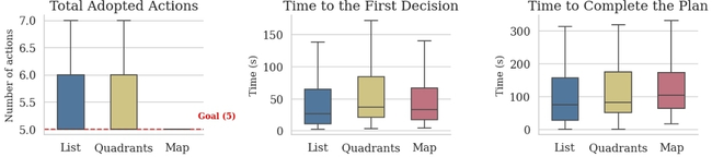
Three boxplots comparing the interfaces on number of adopted actions, time to first decision, and total active time to complete the plan.
We also examined temporal measures of planning. Decision latency showed no significant difference across interfaces (χ2(2) = 3.70, p = .157). Total active time showed a modest omnibus effect (χ2(2) = 7.23, p = .027), driven by a significant difference between the List and Map in post-hoc tests (W = 2200.0, p = .002). The List-Quadrants (p = .385) and Quadrants-Map (p = .352) comparisons were not significant after Bonferroni correction. In other words, the Map did not delay the first commitment, but it did lengthen overall plan completion relative to the List.
4.2 Cognitive Workload: The Cost of Spatial Freedom
To assess the cost of exploration, we analyzed NASA-TLX scores on mental demand, frustration, and effort (Figure 3). Across all three dimensions, the same pattern emerged: the Map imposed significantly higher workload than both structured alternatives.
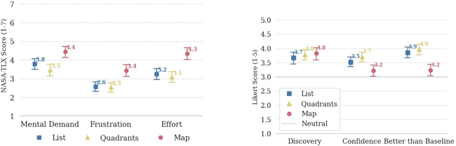
A grouped bar chart showing that the map interface has higher mental demand, frustration, and effort scores than the list and quadrant interfaces.
For mental demand, there was a significant difference (χ2(2) = 34.12, p < .001). The Map was more mentally demanding than both the List (W = 633.0, p < .001) and Quadrants (W = 590.0, p < .001), whereas List and Quadrants did not differ significantly (W = 1052.0, p = .062). The same pattern held for frustration (χ2(2) = 33.31, p < .001) and effort (χ2(2) = 43.55, p < .001): the Map scored significantly worse than both structured views (all p < .001), while the List-Quadrants comparison remained non-significant (frustration: W = 1044.5, p = .852; effort: W = 1158.5, p = .282).
These results show that added structure did not add friction. Quadrants preserved the low workload of the List, whereas the continuous spatial layout required substantially more cognitive work.
4.3 User Preferences: Structured Guidance Is Preferred
Participants’ subjective ratings reinforced the workload pattern (Figure 4). Discovery scores did not differ significantly across interfaces (χ2(2) = 3.84, p = .146), suggesting that the free-form map did not produce a measurable discovery benefit. Confidence, however, differed significantly (χ2(2) = 23.94, p < .001). Participants reported lower confidence with the Map than with both the List (W = 652.5, p = .012) and Quadrants (W = 427.5, p < .001), while the List-Quadrants comparison did not survive Bonferroni correction (W = 594.5, p = .017).
When asked whether the tool was easier to use than the school's current playbook, the difference was also significant (χ2(2) = 26.70, p < .001). The Map scored significantly lower than both the List (W = 687.0, p < .001) and Quadrants (W = 384.0, p < .001), whereas List and Quadrants did not differ (W = 671.0, p = .193).
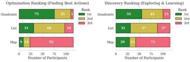
Two stacked ranking charts showing post-study preferences for optimization and discovery, with Quadrants receiving the most first-place votes and Map the most last-place votes.
Post-study rankings sharpen this pattern. Quadrants was ranked first by 75 of 115 participants for Optimization and by 55 of 115 participants for Discovery. The Map was ranked last by 92 of 115 participants for Optimization and by 73 of 115 participants for Discovery. Quadrants was also the overall favorite interface for 69 participants, compared with 29 for the List and 17 for the Map.
5 Discussion and Conclusion
This study shows that the clearest benefit of AI-facilitated sustainability interfaces comes from structured guidance, not from maximum spatial freedom. Adoption volume and perceived discovery were statistically similar across interfaces, but the subjective measures revealed a consistent penalty for the free-form Map. It raised mental demand, frustration, and effort, lowered decision confidence, and was judged less helpful than the original playbook.
The comparison between List and Quadrants clarifies where structure helps. Enriching a list with AI-generated metadata already supports low-effort planning, but quadrant grouping adds an interpretable overview without increasing workload. This balance likely explains why Quadrants received the most first-place rankings for both optimization and discovery. For sustainability planning, users appear to value explicit semantic categories and side-by-side trade-offs more than unrestricted navigation through a continuous feature space.
These findings have design implications beyond sustainability. AI-generated metadata is most useful when it is translated into lightweight scaffolds that reduce interpretation cost. Systems that expose impact, effort, and related trade-offs should prioritize readable grouping and comparison mechanisms rather than maximizing visual freedom. In this sense, intelligent decision support is not only about producing better recommendations, but also about externalizing structure in ways users can act on.
This study has several limitations. It relied on a university-affiliated sample dominated by students and younger adults, so the results may not generalize to other populations or institutions. The study also measured short-term planning rather than long-term behavior change, so higher confidence or preference does not necessarily translate into sustained action. Finally, the interfaces depended on expert curation and AI-generated metadata; future work should examine how metadata quality, transparency, and personalization affect trust and downstream behavior.
Source
Imported from ACM’s structured HTML source. ACM Reference Format: Qiming Sun, Sharon I-Han Hsiao, and Shih-Yi Chien. 2026. Beyond Exploration: AI-facilitated Information Visualization Structure for Complex Context Exploration and Decision-Making in Environmental Sustainability. In 37th ACM Conference on Hypertext (HT '26), September 14--18, 2026, London, United Kingdom. ACM, New York, NY, USA 5 Pages. https://doi.org/10.1145/3800935.3830855
References
[1] Thorhildur Asgeirsdottir and Rob Comber. 2023. Making energy matter: Soma design for ethical relations in energy systems. In Proceedings of the 2023 CHI Conference on Human Factors in Computing Systems. 1–14.
[2] Ambre Assor, Arnaud Prouzeau, Pierre Dragicevic, and Martin Hachet. 2023. Exploring Augmented Reality Waste Data Representations for Eco Feedback.. In Extended Abstracts of the 2023 CHI Conference on Human Factors in Computing Systems. 1–4.
[3] Richard A Becker, William S Cleveland, and Gerald Weil. 1988. The use of brushing and rotation for data analysis. Dynamic graphics for statistics (1988), 247–275.
[4] Benjamin B Bederson and James D Hollan. 1994. Pad++ a zooming graphical interface for exploring alternate interface physics. In Proceedings of the 7th annual ACM symposium on User interface software and technology. 17–26.
[5] Manon Berney, Abdessalam Ouaazki, Vladimir Macko, Bruno Kocher, and Adrian Holzer. 2024. Care-Based Eco-Feedback Augmented with Generative AI: Fostering Pro-Environmental Behavior through Emotional Attachment. In Proceedings of the 2024 CHI Conference on Human Factors in Computing Systems. 1–15.
[6] Sébastien Bubeck, Varun Chandrasekaran, Ronen Eldan, Johannes Gehrke, Eric Horvitz, Ece Kamar, Peter Lee, Yin Tat Lee, Yuanzhi Li, Scott Lundberg, et al. 2023. Sparks of artificial general intelligence: Early experiments with gpt-4. arXiv preprint arXiv:2303.12712 (2023).
[7] Moulay L Chalal, Benachir Medjdoub, Nacer Bezai, Richard Bull, and May Zune. 2022. Visualisation in energy eco-feedback systems: A systematic review of good practice. Renewable and Sustainable Energy Reviews 162 (2022), 112447.
[8] Andy Cockburn and Bruce McKenzie. 2000. An evaluation of cone trees. In People and Computers XIV—Usability or Else! Proceedings of HCI 2000. Springer, 425–436.
[9] Andy Cockburn and Bruce McKenzie. 2002. Evaluating the effectiveness of spatial memory in 2D and 3D physical and virtual environments. In Proceedings of the SIGCHI conference on Human factors in computing systems. 203–210.
[10] Anita Crescenzi, Yuan Li, Yinglong Zhang, and Rob Capra. 2019. Towards Better Support for Exploratory Search through an Investigation of Notes-to-self and Notes-to-share. In Proceedings of the 42nd international ACM SIGIR conference on research and development in information retrieval. 1093–1096.
[11] Global Footprint Network. 2025. Ecological Footprint Calculator. Retrieved from https://www.footprintcalculator.org/home/en.
[12] Marti A Hearst. 1992. Automatic acquisition of hyponyms from large text corpora. In COLING 1992 volume 2: The 14th international conference on computational linguistics.
[13] Sarah Henderson. 2009. Personal document management strategies. In Proceedings of the 10th International Conference NZ Chapter of the ACM's Special Interest Group on Human-Computer Interaction. 69–76.
[14] Janellen Huttenlocher and Clark C Presson. 1973. Mental rotation and the perspective problem. Cognitive Psychology 4, 2 (1973), 277–299.
[15] William P Jones and Susan T Dumais. 1986. The spatial metaphor for user interfaces: experimental tests of reference by location versus name. ACM Transactions on Information Systems (TOIS) 4, 1 (1986), 42–63.
[16] Andrew Kuznetsov, Joseph Chee Chang, Nathan Hahn, Napol Rachatasumrit, Bradley Breneisen, Julina Coupland, and Aniket Kittur. 2022. Fuse: In-situ sensemaking support in the browser. In Proceedings of the 35th Annual ACM Symposium on User Interface Software and Technology. 1–15.
[17] Jasmine Lu, Beza Desta, KD Wu, Romain Nith, Joyce E Passananti, and Pedro Lopes. 2023. ecoEDA: Recycling E-waste during electronics design. In Proceedings of the 36th Annual ACM Symposium on User Interface Software and Technology. 1–14.
[18] Thomas W Malone. 1983. How do people organize their desks? Implications for the design of office information systems. ACM Transactions on Information Systems (TOIS) 1, 1 (1983), 99–112.
[19] Florian Meier. 2024. Using Wikipedia Pageview Data to Investigate Public Interest in Climate Change at a Global Scale. In Proceedings of the 16th ACM Web Science Conference. 365–375.
[20] Iman Naja, Miguel Valdez, and Alessio Antonini. 2024. Social Media and Cities: a case-study based analysis of how digital life influences the urban physical environment. In Proceedings of the 35th ACM Conference on Hypertext and Social Media. 239–245.
[21] Emre Oral, Ria Chawla, Michel Wijkstra, Narges Mahyar, and Evanthia Dimara. 2023. From information to choice: A critical inquiry into visualization tools for decision making. IEEE Transactions on Visualization and Computer Graphics 30, 1 (2023), 359–369.
[22] Kay Owens. 2015. Visuospatial reasoning. An ecocultural perspective for space, geometry and measurement education. Cham: Springer (2015).
[23] Lace M Padilla, Sarah H Creem-Regehr, Mary Hegarty, and Jeanine K Stefanucci. 2018. Decision making with visualizations: a cognitive framework across disciplines. Cognitive research: principles and implications 3, 1 (2018), 29.
[24] Srishti Palani, Zijian Ding, Austin Nguyen, Andrew Chuang, Stephen MacNeil, and Steven P Dow. 2021. CoNotate: Suggesting queries based on notes promotes knowledge discovery. In Proceedings of the 2021 CHI Conference on Human Factors in Computing Systems. 1–14.
[25] Arianna Pera and Luca Maria Aiello. 2024. Shifting climates: Climate change communication from youtube to tiktok. In Proceedings of the 16th ACM Web Science Conference. 376–381.
[26] Napol Rachatasumrit, Gonzalo Ramos, Jina Suh, Rachel Ng, and Christopher Meek. 2021. Forsense: Accelerating online research through sensemaking integration and machine research support. In Proceedings of the 26th International Conference on Intelligent User Interfaces. 608–618.
[27] Ehud Rivlin, Rodrigo Botafogo, and Ben Shneiderman. 1994. Navigating in hyperspace: designing a structure-based toolbox.Commun. ACM 37, 2 (1994), 87–97.
[28] Marc M Sebrechts, John V Cugini, Sharon J Laskowski, Joanna Vasilakis, and Michael S Miller. 1999. Visualization of search results: a comparative evaluation of text, 2D, and 3D interfaces. In Proceedings of the 22nd annual international ACM SIGIR conference on Research and development in information retrieval. 3–10.
[29] Qiming Sun and I-Han Hsiao. 2025. Waste Genie: Emerging Technology Support and Interactive Feedback to Enhance Sustainable Waste Management Learning. Interactive Learning Environments 0, 0 (2025), 1–18.
[30] Qiming Sun and I-Han Hsiao. 2026. Lessons learned from an AI-assisted educational technology for environmental sustainability and waste management. Educational Technology & Society 29, 1 (2026), 388–407.
[31] Melanie Tory, David Sprague, Fuqu Wu, Wing Yan So, and Tamara Munzner. 2007. Spatialization design: Comparing points and landscapes. IEEE Transactions on Visualization and Computer Graphics 13, 6 (2007), 1262–1269.
[32] Barbara Tversky. 2005. Visuospatial reasoning. The Cambridge handbook of thinking and reasoning (2005), 209–240.
[33] U.S. Environmental Protection Agency. 2024. Carbon Footprint Calculator. Retrieved from https://www.epa.gov/system/files/documents/2024-10/calculcator-in-excel.xlsm.
[34] Colin Ware and Steven Osborne. 1990. Exploration and virtual camera control in virtual three dimensional environments. In Proceedings of the 1990 symposium on Interactive 3D graphics. 175–183.
Do you like what you are reading? Subscribe to receive updates.
Unsubscribe anytime